
01
Brief
We understand the business, audience, material and goals.
CUSTOM WEBSITE DESIGN
We design your website around your identity, content and audience. From the page structure to the interface details, we create a clear and consistent visual experience.
IDENTITY ON THE WEB
Colours and a logo are only part of an identity. How content is organised, how typography is used and how photos are presented also shape how the business is perceived.
At ENOR, we design these elements together. We create a visual direction that supports your message and helps visitors understand the offer, find their way and take the next step.
Included in this service
Not included in this service
These can be offered as a separate development project.
This service covers design. Programming, CMS, integrations and launch are development work and are offered separately.
WHAT THE SERVICE INCLUDES
Six parts that build on each other.
We understand the brand, the content and the users.
We organise the pages and the flow of information.
We set the hierarchy before the visual treatment.
We design the screens, components and states.
We adapt the design to the agreed screen sizes.
We connect the key interactions and prepare material for implementation.
CREATIVE DIRECTION
We define a direction that fits the business’s positioning and can be kept consistent across the whole website.
Typography
Aa
Typography · Heading 40/48 · Body 16/26
Palette
Icons
Spacing
We use references to discuss the direction, not to copy compositions or material.
A new logo and a brand book are separate services unless they are included in the proposal.
STRUCTURE & UX
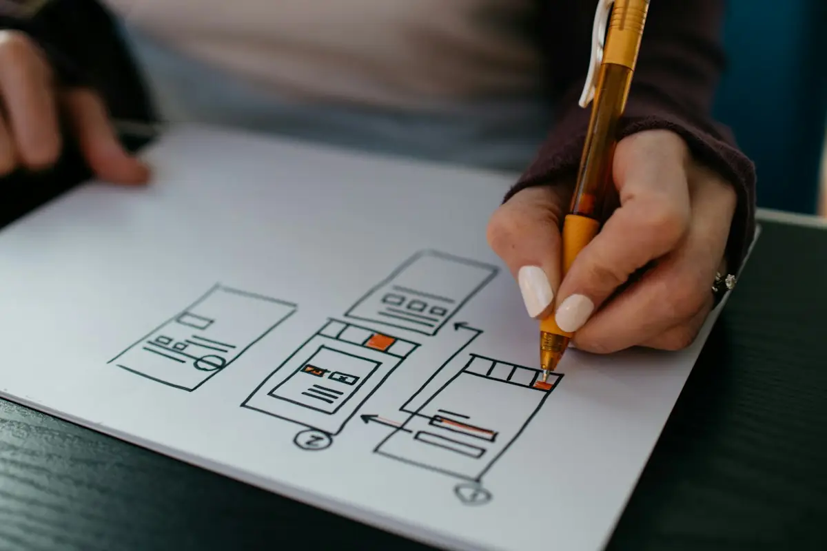
The sitemap and wireframes show what each page contains, in what order and why, before we choose colours or photos.
User interviews, usability tests and extended research are included only when they are part of the project; an internal discussion is not user research.
Pages
Atelier Linea
Notes · Home
Pick a page in the sitemap to see its wireframe and notes.
INTERFACE DESIGN
We design the pages in scope and define how each component looks in every state.
State
Visual specification · Default: The base look.
Pick a component and a state to see the visual specification.
Pages, per scope
States are visual specifications and designed behaviour for the team that will implement them; they are not programmed functionality.
RESPONSIVE DESIGN
We design desktop, phone and, when needed, tablet, and explain how each element behaves between screen sizes.
Behaviour between screens
| Element | Desktop | Tablet | Phone |
|---|---|---|---|
| Navigation | Horizontal menu | Compact horizontal menu | Menu button |
| Projects | 3 columns | 2 columns | 1 column |
| H1 heading | 40 px | 34 px | 28 px |
| Buttons | Inline | Inline | Full width |
| Gallery | Grid | Grid | Horizontal scroll |
The design defines the behaviour; working on devices is confirmed only after implementation and testing.
Spaces that feel like home.
Interior design for homes and offices.
Book a consultationServices
Selected projects
Apartment in Tirana · 120 m²
Office in Durrës · 260 m²
Spaces that feel like home.
Interior design for homes and offices.
Book a consultationServices
Selected projects
Apartment in Tirana · 120 m²
Office in Durrës · 260 m²
Spaces that feel like home.
Interior design for homes and offices.
Book a consultationServices
Selected projects
Apartment in Tirana · 120 m²
Open the menu on the phone and compare the behaviour table between screens.
INTERACTIVE PROTOTYPE
The prototype connects the key screens so you can assess navigation and the flow of use before development starts.
Prototype: simulates interaction, sends no data
Spaces that feel like home.
Click through the prototype like a website. Turn on the clickable areas to see the links.
The prototype simulates interaction. It does not process payments, does not send data and is not a working website.
Not every micro-interaction is built into the prototype; we agree which flows are connected based on scope.
COMPONENTS & VISUAL GUIDELINES
We prepare the project’s styles and reusable components so the development team follows the same rules on every page.
Switch tabs to see the type scale, colours, spacing and grid.
A component library for a project is not a full organisational design system.
The size of the library and the level of documentation are set out in the proposal.
HANDOFF
As agreed, we deliver the material the team implementing the design will need.
Source file
Export-ready assets
Note for the implementation team
Licences for fonts, photos and external material must be clear. Ownership, usage rights and delivered files are set out in the agreement.
Visual review during implementation can be added as a separate service.
HOW WE WORK
The number of concepts, screens and review rounds is set out in the proposal.
We understand the business, audience, material and goals.
We define the pages and the content hierarchy.
We prepare and discuss the proposed style.
We design the agreed pages and components.
We assess the flows and include feedback within scope.
We organise the files and guidance for implementation.
WHY ENOR
Our portfolio shows only real projects, with ENOR’s role, for example “UX/UI design” or “Website design”.
FAQ
More solutions for your business needs.
Tell us about your brand, your audience and the pages you want designed. We will define the direction and the design deliverables.
Sample Logistics Co.
“They translated complex technical concepts into clear decisions for our team.”