
One priority part
For a form, the navigation or a page that causes the most confusion.
- Narrow scope
- Changes that are quick to evaluate
WEBSITE REDESIGN
At ENOR, we review how your website presents the business and guides visitors. We improve structure, navigation and the look, while keeping the elements that matter to your brand and users.
Spaces that feel like home.
Interior design for homes and offices.
Book a consultation
Services
Selected projects
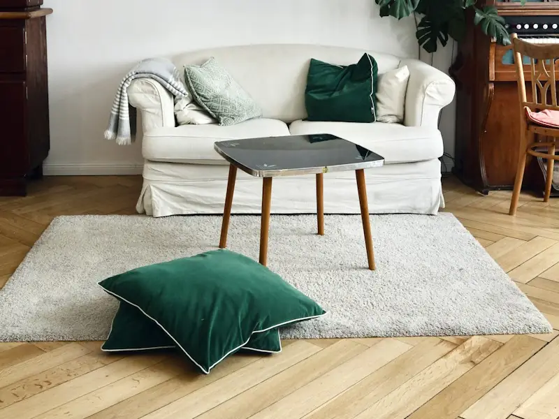
Apartment in Tirana · 120 m²

Office in Durrës · 260 m²
INTRODUCTION
A website can need improvement even when the basic functions still work. The offer may have changed, content may have been added without a clear structure, or the phone experience may be difficult.
At ENOR, we don’t start by replacing everything. We assess what still serves the business, what causes confusion and where the work should focus. Then we design the changes by priority.
This service is the redesign design work. Coding, technical rebuilds, data migration, publishing and maintenance are offered through other services with their own scope.
WHEN A REDESIGN MAKES SENSE
Concrete situations, not the age of the site, show whether a redesign is needed.
We don’t assume a website needs a redesign just because of its age.
A new look doesn’t follow a trend unrelated to the business need.
WHAT THE SERVICE INCLUDES
The number of pages and depth of analysis are set in the proposal.
We review the structure, screens and main flows.
Result: Assessment summary with priorities
We define what is kept, reorganised or prepared.
Result: Content inventory and new structure
We design the hierarchy and role of pages.
Result: Wireframes of the main pages
We update typography, colours and components in line with the brand.
Result: Approved screens and components
We adapt screens and link the main interactions.
Result: Mobile variants and a prototype
We prepare files and guidance for implementation.
Result: Files and a list of key changes
ASSESSING THE EXISTING SITE
We review the main pages and the flows that matter most to the business, and clearly separate observations, data, assumptions and hypotheses.
What can be reviewed
When there is access and it is in scope
We don’t call a visual review a technical check or a security audit.
What we saw while reviewing the site.
The menu has eight links at the same level.
Header · every page
Services are described in a single paragraph.
Home · About us
Contact appears only as a link at the bottom.
Home and service pages
Switch tabs: every finding keeps its source or how it will be verified.
REORGANISING CONTENT
We inventory pages, remove repetition and connect content with navigation. For every important page we define the audience, goal, message and action.
| Page | Audience | Goal | Action | Decision |
|---|---|---|---|---|
| Home | New visitors | Orientation | See services | Reorganise |
| Services | Prospective clients | Explain the offer | Book a consultation | Reorganise |
| Projects | Prospective clients | Proof of work | See the project | Keep |
| Gallery | Prospective clients | Photos | See projects | Merge |
| About us | Clients and partners | Trust | Meet the team | Update |
| Partners | Partners | Collaborations | Contact | Reorganise |
| News | Existing clients | Announcements | Read more | Update |
| Contact | Everyone | Contact | Send a request | Reorganise |
Filter by decision or compare the existing navigation with the proposed one.
For every important page
We don’t remove valuable pages or content just to shorten the menu.
Full copywriting and translation are set in the proposal.
USER EXPERIENCE
We review the flows that matter to the business: from the starting point to confirmation, with choices, errors and going back.
We design
We don’t change a familiar flow without a clear reason. When user testing is done, we present only real results and their limitations.
The proposed path; verified in the prototype and after implementation.
Compare the existing path with the proposed one.
VISUAL UPDATE
Together with you, we decide what to keep from the current identity and what to update, so the new site is clearly yours.
A redesign doesn’t automatically mean a new logo or a full rebrand, and no look stays free of future updates.
MOBILE AND RESPONSIVE
We don’t carry the desktop problems into a narrower version. We reorganise content for the phone and keep the key information.
Spaces that feel like home.
Interior design for homes and offices.
Book a consultationServices
Selected projects
Apartment in Tirana · 120 m²
Switch between the existing site and the proposal on the phone.
PARTIAL IMPROVEMENT OR FULL REDESIGN
Three approaches we choose after the analysis and within the project’s constraints. They are not price packages.
For a form, the navigation or a page that causes the most confusion.
For sections that need new structure and components, such as services or projects.
When the identity, the offer or the way the site should be organised changes.
The proposal is based on the analysis and the project’s constraints, not on a predefined package.
SEO AND KEEPING EXISTING VALUE
During design we identify the important pages and topics and document what may change, so the implementation team can plan for it.
We separate design from technical migration. Redirects, canonicals, sitemaps and indexing checks are done during implementation by the responsible team. We don’t guarantee rankings will be kept after a redesign.
| Existing URL | Proposed URL | Status |
|---|---|---|
| /services | /services | Kept |
| /gallery | /projects | Merged |
| /projects/apartment-tirana | /projects/apartment-tirana | Changes · documented |
| /about-us | /studio | Changes · documented |
| /contact | /contact | Kept |
The list is passed to the implementation team; redirects and indexing checks are done during development.
PROTOTYPE AND EVALUATION
The prototype shows the new navigation, moving between pages, the form, choices, errors and confirmations. For each key change we explain the problem, the solution and what still needs verifying.
Problem
Eight links at one level; services can’t be told apart.
Proposed solution
Four groups based on how clients search.
What is verified
Do visitors find the services unaided.
The prototype is not a working website. User checks or an expert review are included as agreed.
DELIVERABLES
As agreed, the implementation team gets materials that explain what changes and why.
Source files, licences and rights are set in the agreement. Coding, migration and publishing are not included automatically.
Source file
Export materials
List of key changes
PROCESS
Review rounds are set in the proposal; we don’t promise unlimited revisions.
We understand what has changed in the business and what needs improving.
We review the site and the information available.
We define the changes and the scope.
We organise content and flows.
We design the screens and interactions.
We include feedback within the agreed rounds.
We prepare the materials for implementation.
WHY ENOR
In our portfolio we explain ENOR’s actual role and what was redesigned.
FAQ
More solutions for your business needs.
Send us the website address and tell us what you want to improve. We’ll define the scope of the assessment and redesign.
Sample Logistics Co.
“They translated complex technical concepts into clear decisions for our team.”