
01
Brief
We understand the audience, pages and goals.
RESPONSIVE WEB DESIGN
We design how your website looks and works on phone, tablet and desktop. We adapt the structure, navigation and visual details so information stays clear at different screen sizes.
Spaces that feel like home.
Interior design for homes and offices.
Book a consultation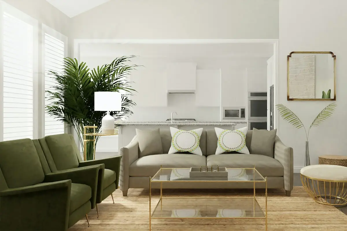
Services
Selected projects
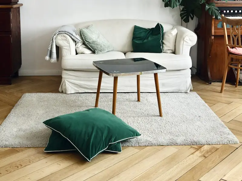
Apartment in Tirana · 120 m²
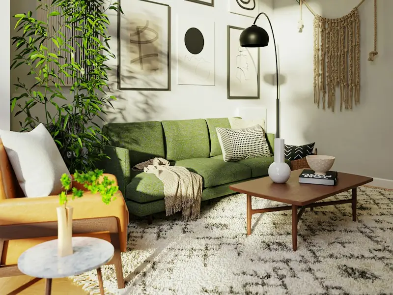
Office in Durrës · 260 m²
Spaces that feel like home.
Interior design for homes and offices.
Book a consultationServices
Selected projects
Apartment in Tirana · 120 m²
Office in Durrës · 260 m²
Spaces that feel like home.
Interior design for homes and offices.
Book a consultationServices
Selected projects
Apartment in Tirana · 120 m²
WHAT RESPONSIVE DESIGN IS
Responsive design defines how content is reorganised when screen space changes. A multi-column layout can become a vertical flow; navigation changes shape, and elements adapt to touch or to mouse and keyboard.
At ENOR, we design these changes as part of one experience. We keep the identity and the important information, while adapting how they are presented.
This service covers design: the screens, the rules and the prototype. Programming and launching the website are development work.
Services
Design
Furnishing
Lighting
Mobile · 1 columnCards one after another; 15 px text.
Services
Design
Furnishing
Lighting
Tablet · 2 columnsThe third card wraps to the next row.
Services
Design
Furnishing
Lighting
Desktop · 3 columnsAll cards in one row; 22 px title.
PROBLEMS WE SOLVE
Each problem has a design approach and a section where we explain it.
Problem: Small text on phones
Design approach: Suitable hierarchy and sizesProblem: A menu that takes over the screen
Design approach: Navigation organised around contentProblem: Buttons too close together
Design approach: Spacing and touch-friendly targetsProblem: Hard-to-use forms
Design approach: Clear flow and labelsProblem: Photos that lose their subject
Design approach: Cropping and treatment per layoutProblem: Content overflowing the screen
Design approach: Reorganisation and defined behaviourWHAT THE SERVICE INCLUDES
The number of unique pages and screen variants is set out in the proposal.
We identify problems at different sizes.
We set priorities for limited space.
We design the agreed pages and components.
We adapt menus, forms and controls.
We assess the key flows.
We prepare the files and behaviour notes.
THE MOBILE-FIRST APPROACH
On a small screen, every decision about order and space becomes more visible. A mobile-first approach helps us define the key message, information and actions before expanding the layout.
Switch from phone to desktop: the priority order stays, the layout expands.
Mobile-first is a way of designing. It is not the same as Google’s mobile-first indexing.
Mobile-first does not mean removing key content from phones; the order and presentation change.
LAYOUT & BREAKPOINTS
We set the points where the layout changes based on the content, not just on device names. For each component we note its behaviour between sizes, not just three screenshots.
In the design notes we show
TYPOGRAPHY & CONTENT
We set sizes, line length and line height for every screen size, and test them with real or representative content, including long titles and other languages.
We do not shrink text until it becomes unreadable, and we do not cut essential information for aesthetic reasons.
Interior design for homes and offices in Tirana
We start from how you live and work, then choose materials, furniture and light.
Change the screen and the language: see how the long title wraps and how sizes change.
IMAGES & MEDIA
For every place an image appears, we define the ratio, the crop and the focal point so the subject is not lost when the shape changes.
The subject is kept
Turn the focal point on or off and compare the crops for each screen.
Important text is never placed only inside an image.
We deliver guidance for visual variants and assets; technical optimisation of files and loading belongs to implementation. A prototype does not measure speed.
FORMS & COMPONENTS
We design fields, buttons, filters, tabs, accordions and dialogs for touch and keyboard, with the states each one needs.
States per component
Open the keyboard, submit the form with an empty field and see where the error appears.
TABLES & COMPLEX CONTENT
We adapt tables, catalogues, pricing plans and dashboards according to their meaning, not with one solution for all.
Plan
Details
The packages are illustrative, not prices.
Switch the phone layout: a priority column with details, or local scrolling.
We do not automatically turn every table into cards if the comparison would be lost.
When a table needs horizontal scrolling, it is local and visible, not the whole page.
RESPONSIVE & ACCESSIBILITY
During design we define the order, contrast, focus and spacing that support an accessible implementation.
Status is not shown by colour alone
Mobile-first does not guarantee accessibility.
Design specifications support an accessible implementation; final compliance also requires coding and testing.
RESPONSIVE DEMO
The same content, with different layouts. Pick a screen or change the width.
Spaces that feel like home.
Interior design for homes and offices.
Book a consultationServices
Selected projects
Apartment in Tirana · 120 m²
Office in Durrës · 260 m²
Desktop: Title and photo side by side · 3 columns
This demo shows a concept; it does not test your website and is not an audit.
DELIVERABLES
Depending on the scope, we deliver the material the development team needs to follow the designed behaviour.
Source file
Export-ready assets
Note for the implementation team
Three different things
Implementation and launch are not included automatically. Ownership, licences and handoff are set out in the agreement.
PROCESS
The number of screens and review rounds is set out in the proposal.
We understand the audience, pages and goals.
We examine the existing design and its problems, if any.
We define the hierarchy and flows.
We create the responsive screens and components.
We assess the experience with representative content.
We organise the files and guidance for implementation.
SEO
Responsive design helps organise the same content for different screen sizes. This creates a more consistent foundation for users and for managing the website.
Google uses the mobile version of content for indexing. That is why, during design, we keep the key information and the necessary links on mobile screens too.
Rankings depend on content, technical implementation and other factors. Responsive design is not a guarantee of a position in search results.
FAQ
More solutions for your business needs.
Tell us which pages you want designed or improved. We will define the screens, components and deliverables needed.
Sample Logistics Co.
“They translated complex technical concepts into clear decisions for our team.”